Apache Superset allows users to explore and visualize data from various sources. In our previous articles, we have talked about transferring data from excel to the database via Python program and transferring multiple databases (Oracle, Postgre, Microsoft Sql, My Sql) to the database by combining them via Python and data transfer from EXCEL file to an another database by Python. In this article, we will try to explain how to prepare a dashboard with Apache Superset and Steps to prepare a dashboard with Apache Superset BI over the records transferred to the database or over any database.
Before moving on to these processes, it should be noted that. Whether our data is transferred from excel or any database with Python or we directly access any database data, the dashboard preparation processes are always the same. So the important thing here is the target database.

Creating a dashboard with Apache Superset takes place in 4 steps:
- Database connection settings
- Dataset creation
- Chart creation
- Dashboard preparation
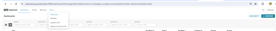
- Database connection settings
From the Data tab, click on the Databases section.
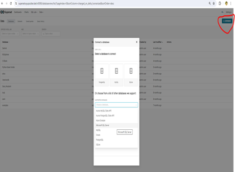
Here the previously connected databases are displayed. Click on the Database button to connect to a new database. Select the database to be connected from the list. Here we select Microsoft SQL as an example.
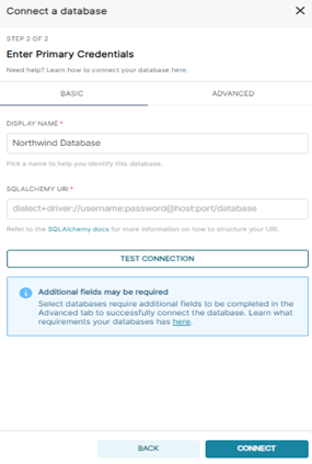
Enter the connection settings as written in the SQLALCHEMY URI section. Then press the TEST CONNECTION or CONNECT buttons.
mssql+pymssql://Username:Password@Host:Port/Database Name
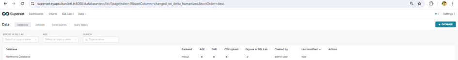
If the connected database does not have a connection error, it comes to the connected database list.
You can see detailed information about connection settings and supported databases at the link below
https://docs.preset.io/docs/connecting-your-data
- Dataset creation
Dataset represents the data sources within the SuperSet. A dataset can be taken from various data sources such as a database table, a CSV file.
Datasets can be created in two ways from the SQL editor window or from the Dataset section.
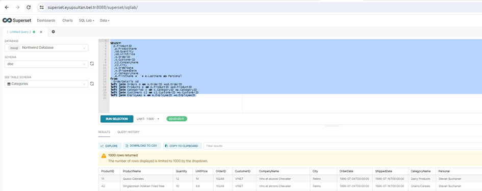
- Create Dataset from Sql Editor window
Select database from the top left. Then write the code in the editor window and run it. The output of the query is shown at the bottom of the screen. If the query is to be saved, it is saved with the “Save As” button. Click on the “Explore” button to transfer the created query to the Dataset section.
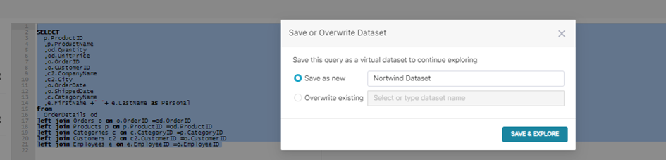
After clicking the “Explore” button, give the Dataset name from the screen that appears and click the “Save&Explore” button.
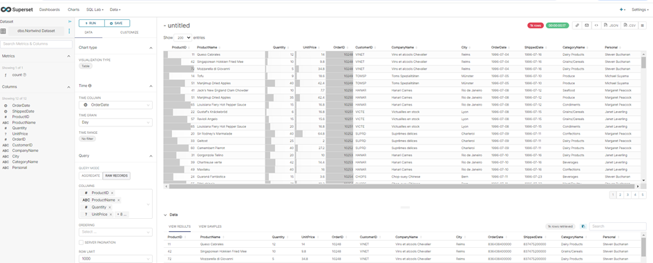
The stored Dataset content is seen graphically as a table. With the “Save” button, this table can be used graphically in the dashboard.
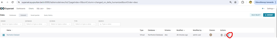
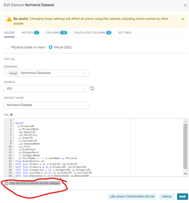
If changes will be made to the query in the created dataset, select the dataset and click the edit button.
On the screen that appears, click the lock icon next to the “Click the lock to prevent further changes.” icon to make changes to the query and click the “Save” button. If new columns are added in the query, click on the “Columns” tab after saving the columns so that the columns appear on the chart preparation screen. Click on the “SYNC COLUMNS FROM SOURCE” button and click on the “Save” button again.
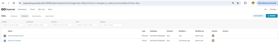
- Create Dataset from the Dataset screen
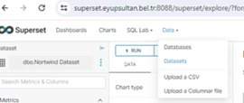
If you have prepared your query in another editor program and created a “view”, Dataset can be created with this view. For this, click on the Datasets section from the Data tab.
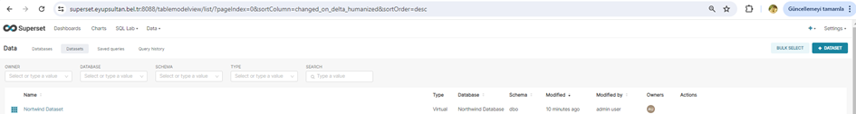
The created Datasets appear on the screen. Click on “+ DATASET” button to open the Dataset creation window.
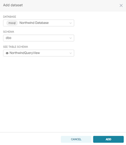
In the dataset creation screen, the view I created from the sql management studuo program query screen is selected and the “ADD” button is pressed.
As can be seen, the 2 separate datasets created are also seen on the screen.
If changes will be made to the query in the created Dataset, changes are made in the Database view. If new columns are added in the query, click on the “Columns” tab after making changes in the view to bring the columns to the chart preparation screen. Click on the “SYNC COLUMNS FROM SOURCE” button and click on the “Save” button again.
3. Create a graph
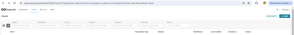
Since charts cannot be created from the Dashbord section, charts must be created from the chart screen. For this, the Charts screen is opened. Previously opened charts are seen. “+CHART” opens the chart creation window or a previously created chart is selected, saved differently and the chart is created. In our example, we will create a chart with “+CHART”.
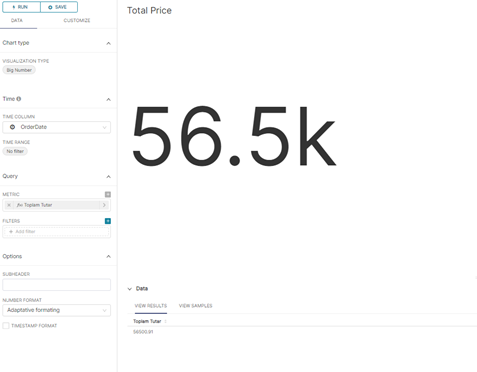
Select the database from the “CHOOSE A DATASET” box. Then select the chart type to be created. Let’s make a Big Number Kart chart as an example. Select the chart and click on the “Create New Chart” button.
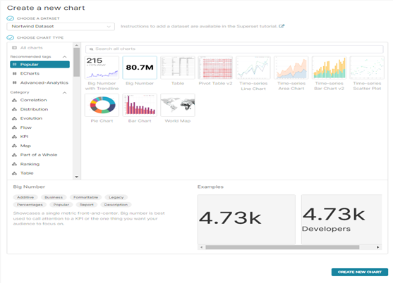
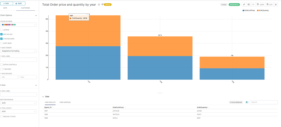
Now let’s make 2 separate charts showing Total Sales amount and Total Sales Quantity.
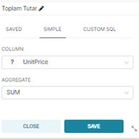
From the Metric section, take the sum of the unit price field as below.
The name is changed and saved with the ” Save” button.
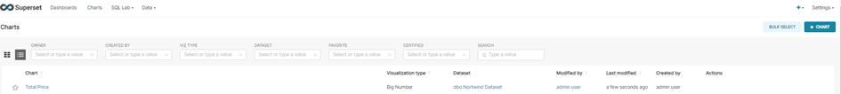
The Saved graph is displayed on the graph screen.
To prepare a chart for total quantity sold, select the relevant chart. The chart opens. Metric is changed to Quantity. “Save” is selected
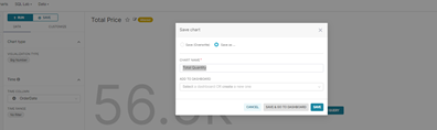
If no further changes are to be made afterwards, the save window is opened first with save and then saved by changing the name with save as.

Other Popular Charts
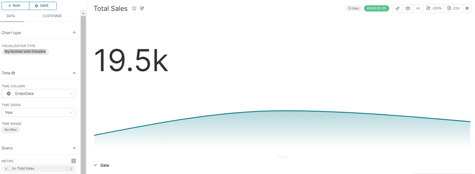
Big Number with Trendline
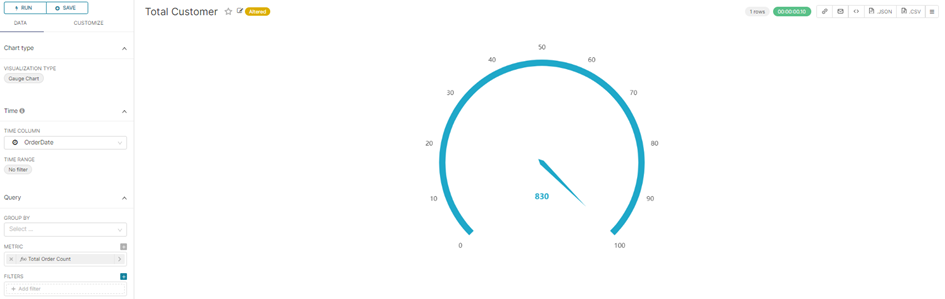
Gauge Chart
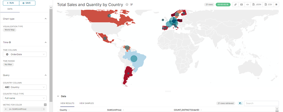
World Map
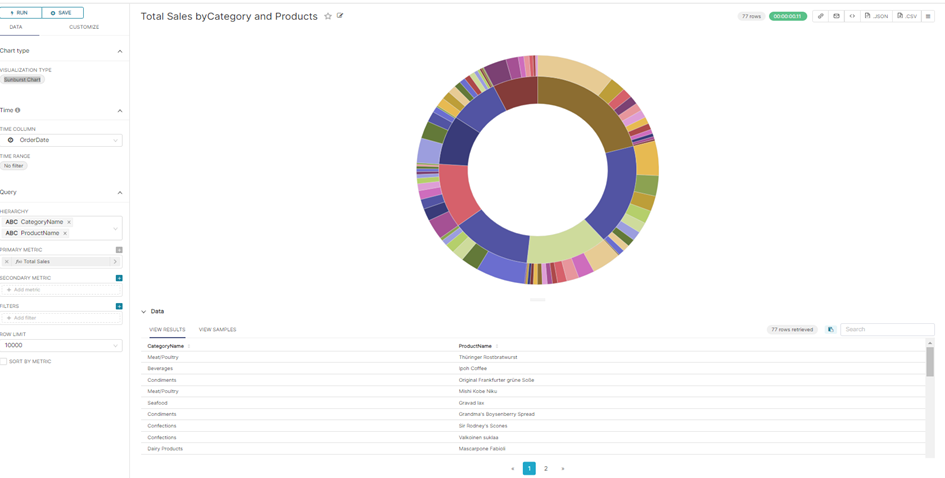
Sunburst Chart
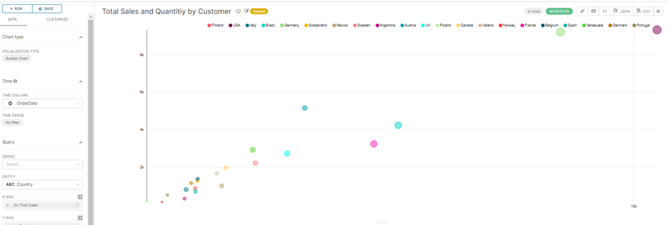
Bubble Chart
Bar Chart
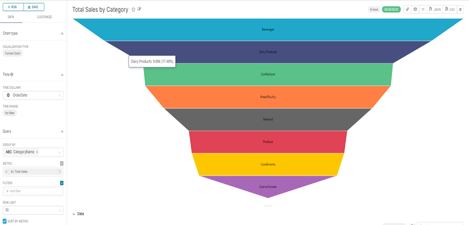
Funnel Chart
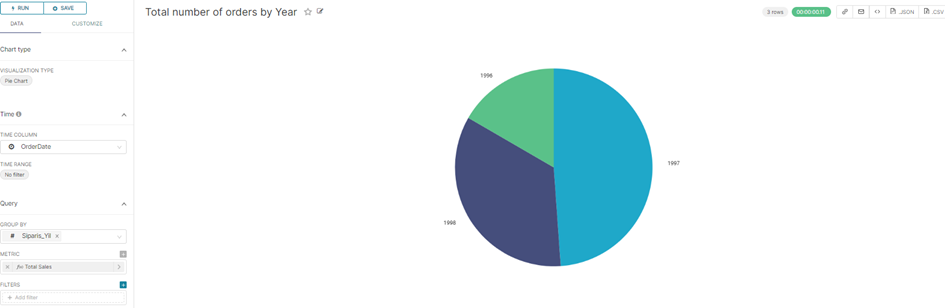
Pie Chart
4. Dashboard preparation
Enter the Dashboard section to create a dashboard for the prepared graphics. A new dashboard screen opens with the +DASHBOARD button.

Give a name to the dashboard. The Save button is pressed.

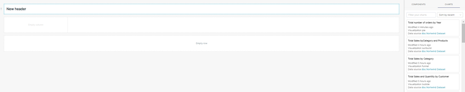
In the Components section, placements are made for the design before the graphics are added.
Meaning of Components:

Tabs: If we want to separate the dashboard into tabs, a separate design can be made for each tab with the tab button. For example, it may be desired to see sales, Human Resources, Finance reports separately as a dashboard.
Rows: Shows each row in the dashboard. Charts are placed in rows.
Columns: It is used if the charts are to be placed in columns within rows.
Header: Used to add a title
Markdown: Allows users to create rich text elements in their visualizations
Divide: It is used if you want to show the charts in separate sections in the dashboard.
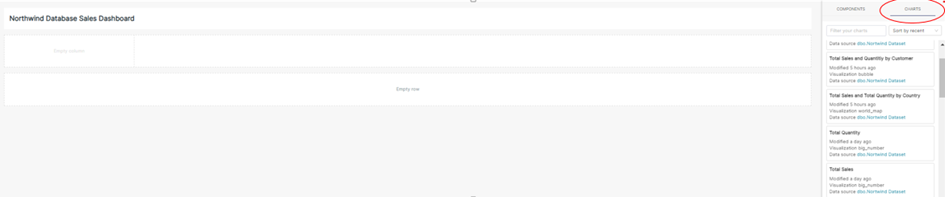
Adding Charts for Dashboard:
Draft :
- Line ; Header
- Row and 2 column
- Row Row
Dashboard prepared according to the Draft above
The charts prepared from the Charts section are placed on the draft. Save with the “Save” button.
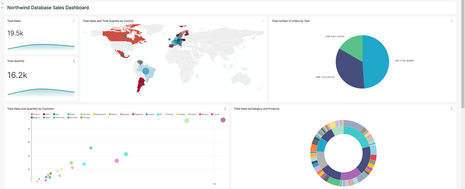
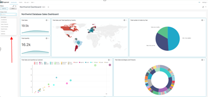
Sample Prepared Dashboard
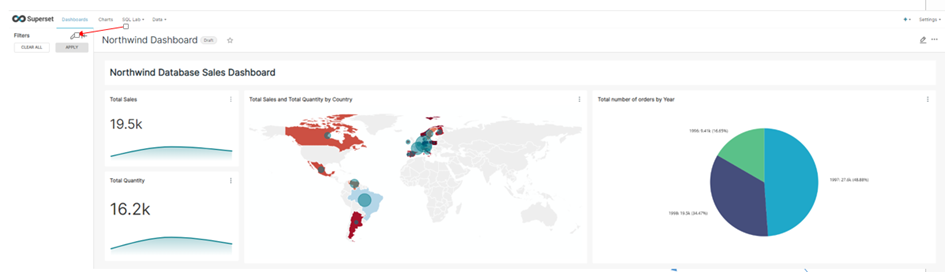
Add Filter for Dashboard
Click the Filter button
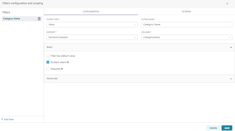
Enter values in Filter Type, Filter Name, Dataset, Column Name fields. Other filtering fields are added without entering from the screen. And the Save button is pressed.
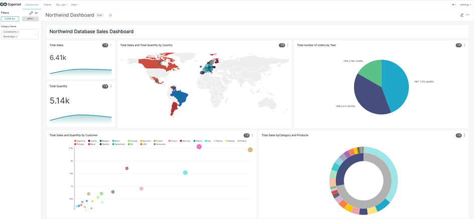
The filter value is selected according to the added filter option.
Dashbord chart values are updated according to the selected filter value.
AHMET GÜNOĞLU
ERP Consultant and Business Intelligence Expert