In our previous article, we discussed “COUNT, DISTINCTCOUNT, and DISTINCTCOUNTNOBLANK functions” in Power BI Dax. In this article, I would like to talk about the , Power BI Scatter Plots.
Data analysis and visualization are essential tools for science, business, and much more. Different types of charts are used to understand data, extract meaningful insights from it, and communicate the results to others. In this post, we will explore what scatter plots are, what they are used for, and when they are used.

What are Scatter Plots?
Scatter plots are a type of graph that visualizes the relationship between two or more variables. Each point on the plot represents a single observation in the data set, and the points are plotted on the x-axis and y-axis. This allows us to gain insights into the relationships between the variables.
What Are Scatter Plots Used For?
Scatter plots are used for a variety of purposes, including:
- Visualizing relationships: Scatter plots are used to understand the relationships between variables. For example, scatter plots are often used to visualize a linear relationship between two variables.
- Identifying outliers: You can use scatter plots to identify outliers in your data set and see how these values behave relative to the other data.
- Analyzing trends: Scatter plots are used to track trends and patterns between variables. This can be important for future predictions or decisions.
How to Create Scatter Plots in Power BI
There are many data visualization tools and programs available to create scatter plots. These tools typically allow you to enter the data and select which variables you want to use for the x-axis and y-axis. Then, the graph is automatically generated.
Conclusion
Scatter plots are an important part of the data analysis and visualization processes. They are useful for visualizing the relationships between two or more variables and discovering important insights in your data set. When used correctly, scatter plots can help you better understand your data and make more informed decisions.
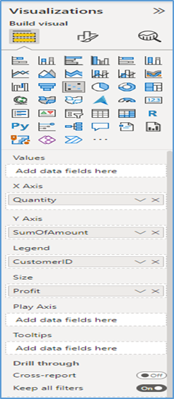
First, let’s look at what the areas in a Power BI Scatter plot do, and then we’ll create an example.
- X-Axis: specify what column represents the horizontal axis
- Y-Axis: specify what column represents the vertical axis
- Legend: to specify which column sub-divides the Details data
- Size: specify the column that represents the marker sizes
- Play-Axis: specify what column (usually a date column) is responsible for the trend overtime.
- Tool Tips: add a data field or measure to be included in information displayed when hovering on a mark in the char
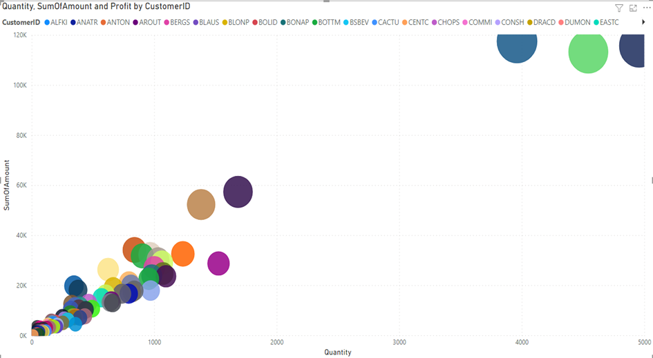
In the report, we want to see sales to customers in terms of quantity, profit, and sales amounts. In the report, we will try to achieve the following results.
- Are our sales amounts increasing as the quantities of sales increase? Data relationship
- Are our profitability increasing in the same way as our sales amounts increase?
- When we look at customers, in which ranges are our sales amounts and sales quantities concentrated?
- Which of our customers reached outlier values? What is the profitability of our customers who we sell the most?
- We can increase the number of questions we want to answer like this.
- First, we add the areas we want to see in our graph
First, we add the areas we want to see in our graph.
- X-Axis: We add the “Quantity” column for the total sales quantities.
- Y-Axis: We add the “SumOfAmount” column for the total sales amounts.
- Legend: We add the “CustomerId” column to see the distributions on a customer basis.
- Size: We add the “Profit” column to understand the profitability of our customers by looking at their sizes, as we see the sales distributions.
The result of our report is as follows.
Animation with Play Axis
Play Axis animates the movement of the relevant category from where it is to where it is by also incorporating the time dimension. The relevant field is selected in the Play Axis section. We select the YEAR field because we want to see the status of customers by year.
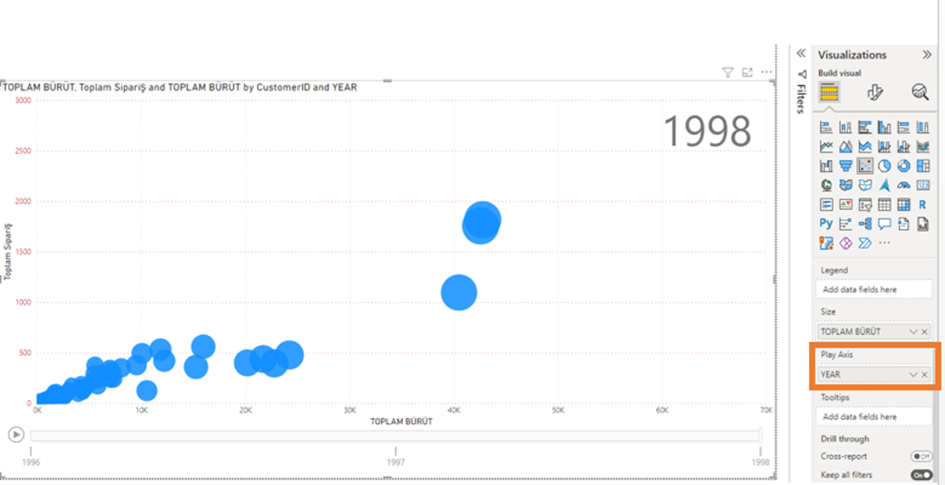
In the following graph, it is possible to understand which customer has gone where by “playing” the scatter diagram on a yearly basis.
AHMET GÜNOĞLU
ERP Consultant and Business Intelligence Expert
https://www.ahmetgunoglu.com/blog
https://medium.com/@ahmetgunnnnn