In our previous lesson, we explained the SWITCH function in Power BI DAX. In this article, I believe you can find the answer to the question of how to create Power BI DAX Date Dimension Tables.
One of the biggest needs in business intelligence software is working with date and time records and tables. In Power BI DAX, date dimension tables are used to organize date data and work with dates in reports. Date dimension tables structure date data into different time frames such as day, month, year, quarter, and period. This provides an easier and more efficient way to work with dates.
Now, let’s take a look at how we create the records above. We create a Date dimension table based on the dates in the main tables we want to work with. These can be dates such as registration date or order date. Here are the commands we use:
In Power BI DAX, there are several ways to create date dimension tables. The most common way is to use the CALENDAR() or CALENDARAUTO() functions. These functions return a single-column table containing date data.
- CALENDAR():
The CALENDAR() function returns a table containing all the dates within a specified date range. The function takes two date parameters:
- MIN: Represents the start date in the selected column.
- MAX: Represents the end date in the selected column.
Let’s do our example based on the “OrderDate” column, which stores the order dates in the “northwind” database’s “orders” table.
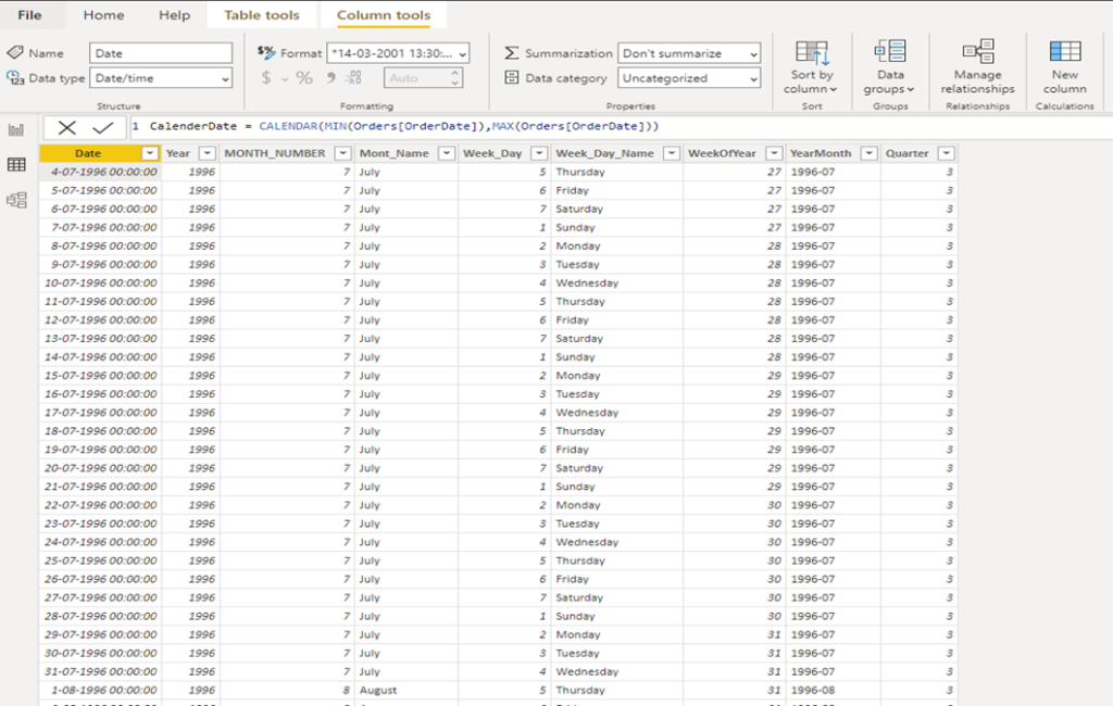
CalenderDate = CALENDAR(MIN(Orders[OrderDate]),MAX(Orders[OrderDate]))
As a result of this operation, a new table named “CalendarDate” is created, and this table represents a calendar range that includes the start date with MIN() and the end date with MAX(). Please note that we are getting the data from the “OrderDate” column in the “orders” table.
This way, you can create a calendar table using the date range from your data. You can use the created “CalendarDate” table to build your reports or charts.
Now, let’s create the other columns that we will use when creating charts in the “CalenderDate” column we have created. You can create columns using NEW COLUMN.
2. YEAR(): Represents the dates in the “CalendarDate” column as years
Year = YEAR(‘Calender'[Date])

3. MONTH(): Displays the month values of the dates in the “CalendarDate” column as numbers.
MONTH_NUMBER: MONTH(‘Calender'[Date])

4. Mont_Name = We will use the following formula to retrieve the names of the months found within the Date.
FORMAT(‘Calender'[Date],”MMMM”, “en-US”)

5. WEEKDAY(): Indicates on which day of the week the dates in the Date are.
Week_Day = WEEKDAY(Calender[Date])

6. Week_Day_Name = Displays the names of the days of the week on which the dates in the Date are.
Week_Day_Name = FORMAT(Calender[Date],”dddd”,”en-US”)

7. WEEKNUM() = Displays the year week number for dates within the Date dimension.
WeekOfYear = WEEKNUM(‘Calender'[Date]
Quarter = QUARTER(Calender[Date])

In addition to the types of time we created above, we can create different types of time from the date columns we generated with CALENDER(). For example, if we want to create a comparative year-quarter chart, we can create a new column by combining the year and quarter columns and transfer it to the chart.
Let’s create a sample chart to see what these date-time columns we created do. Here are the steps we need to take:
- First, let’s check and establish the relationship between the columns in the table we’ve created, Calender[Date] and Orders[OrderDate], by clicking on the ‘manage relationship’ menu

2. If this relationship has not been established automatically, it will be set up. If it’s not automatic, it can be established from the screen below

3. We have set up our relationship. Now we can create our graph. For this, let’s create a donut card.

As you can see above, we have created the total number of customers by year. To create our graph, we counted the number of distinct customerID in the Orders table on the right with the distinctCount function. We took the Year values from the newly created Datedimension table.
Legend: YEAR
Valus: DistinctCountofCustomerId
Thank you for reading.Don’t forget! You learn better when you can apply what you’ve read.
You can watch what I explained above on my YouTube channel.
AHMET GÜNOĞLU
ERP Consultant and Business Intelligence Expert
https://www.ahmetgunoglu.com/blog
https://medium.com/@ahmetgunnnnn